Sunday, April 23, 2006

Design & Image - Project 3


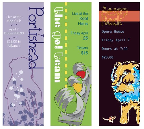
This was done in India ink and then scanned and colourized in pantone. It is a poster done to illustrate the Aesop's fable 'The dancing monkeys' but I put it into a modern context. The idea is that rather being monkeys dressed as courtiers, today's monkeys are actually people dressed in suits who go off to work each day.

Design & Image - Project 2


For this project we had to go out into an area and photograph it in the context of a particular word. From the list, I chose iconoclastic (others did fragmented, quixotic, circulatory, etc.) I went to the alleys between Richmond and Queen off of Spadina and photographed the graffiti. We then also had to incorporate text, so I chose "White Riot" by the Clash because I thought it seemed appropriate. I wanted to print out the back images and then scan the lyrics on lined paper (taped down with masking tape) on top, but I ran out of time.

Design & Image - Project 1


This was done for Design & Image and the goal was to create a package for a personal item of ours and the exterior should allude to what is inside. I did my headphones, so first did some analog (as well as realistic) drawings and also researched how headphones are made and the science of electricity (my teacher loves crazy process work :p) and then scanned in some of my drawings and experimented with brushes and lines. The icon seen on the top and bottom were made by tracing a realistic drawing and then live painting it. We also had to find templates and modify them as our own to create the package.

Design and Colour - Project 3


We learned about using pantone colour for this project, and we had to create six tickets, (three in solid uncoated - the three at the top, and three in solid coated - the three bottom) for three bands of different genres. Some of the images were live traces of other photos, and for a couple of them I used my tablet. I also scanned some lace and then live traced it for the grey Portishead ticket. Not a terribly successful project, but it's alright.

Design and Colour - Project 1


For this one, we had to make coasters for the "Sense" design show using six different colour schemes (triadic, monochromatic, cool dominance, analogous, warm dominance and complementary).
I did mine based on abstract illustrations of scientific ideas, and these were done in Illustrator and I used my tablet. I would like to use it more often, this was sort of an experiment
.

Type I - Project 2


This is project 2 from Typography I of first semester. We had to research an ancient form of writing and then create a mark based on that form. I did Native American pictograms. We then had to photograph it and incorporate it into a book layout. The final is mouned on a board, and I used foamcore to make a fake book shape (I'm just too lazy to photograph it at the moment). And yes, I did use Zapfino... it was first year, and I was young and naive.

Visual Language I - Project 3


For this project we were given random dollar store objects and had to photograph them in unique and abstract ways, without knowing why. After the pictures were taken, we then found out that we would have to create a poster for a play using those photos. My objects were several toy dogs, and I chose Macbeth as my play.

Saturday, April 22, 2006

Type I - Project 3


This is also from Typography I and for this assignment, we had to choose an obscure word that other people may not know the meaning of, and then depict it in a way that illustrated the meaning.
I created each one by printing the definition on a transparency and the freezing it in a container. I then photographed the different ice blocks using different angles and lighting techniques. I then tweaked the photos in photoshop to enhance colour and sharpness of the images. I did a lot of photogs, these were the better 2, and I ended up handing in the top one.